Please rotate phone

Rebesana
Creative Direction, Packaging Design & Integrated Campaigns
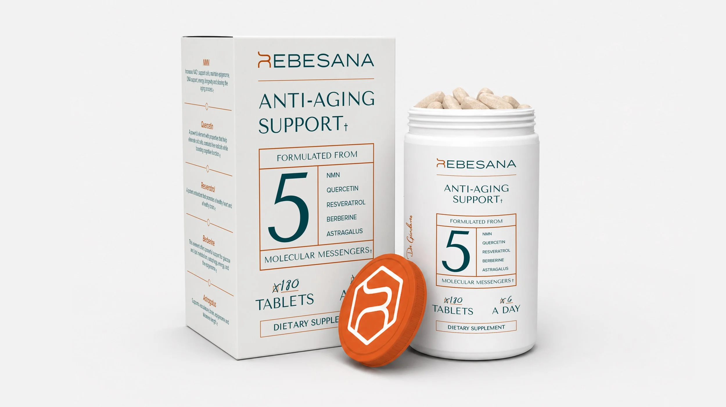
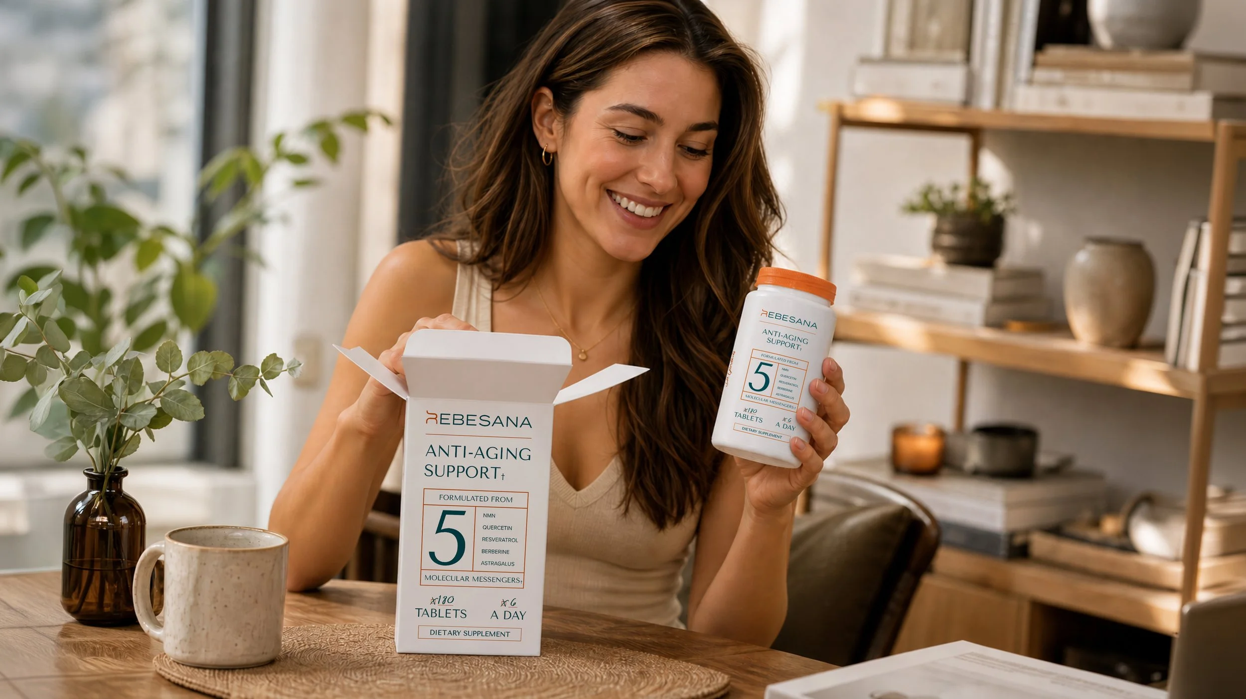
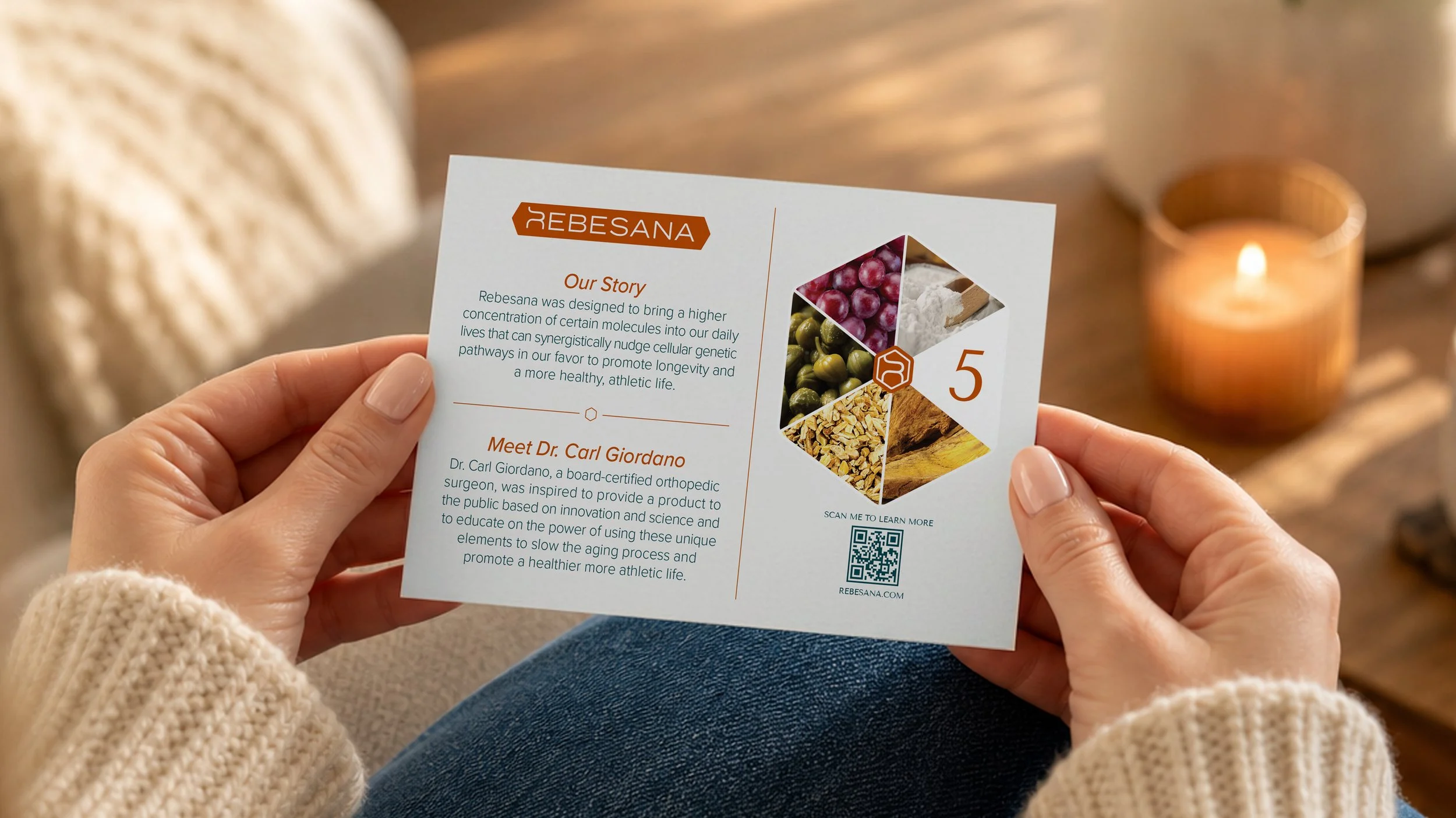
Rebesana is a longevity-focused wellness brand rooted in science, innovation, and molecular research. Built around a proprietary blend of five natural ingredients designed to support cellular health and healthy aging, the brand required a complete identity system spanning packaging, digital experience, and marketing. From logo development and packaging design to Shopify UI/UX and product presentation, every touchpoint was created to communicate trust, credibility, and modern scientific sophistication.
Client:
Rebesana
Agency:
Ruckus
My Role:
Creative Director
Brand Development
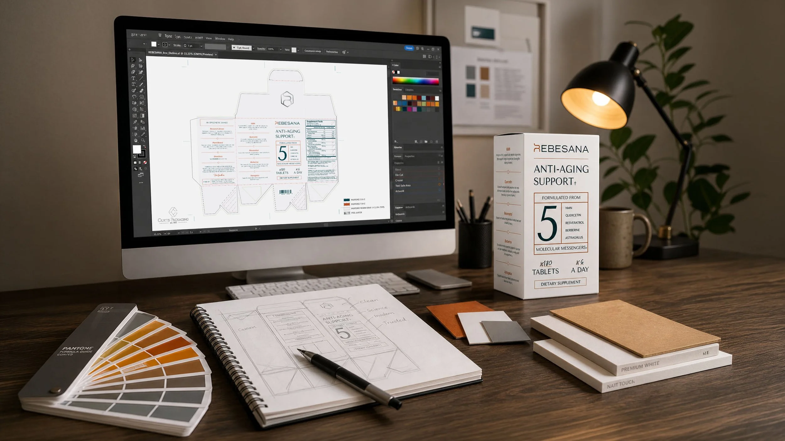
Packaging Design
UI/UX Collaboration
Art Direction
My Role
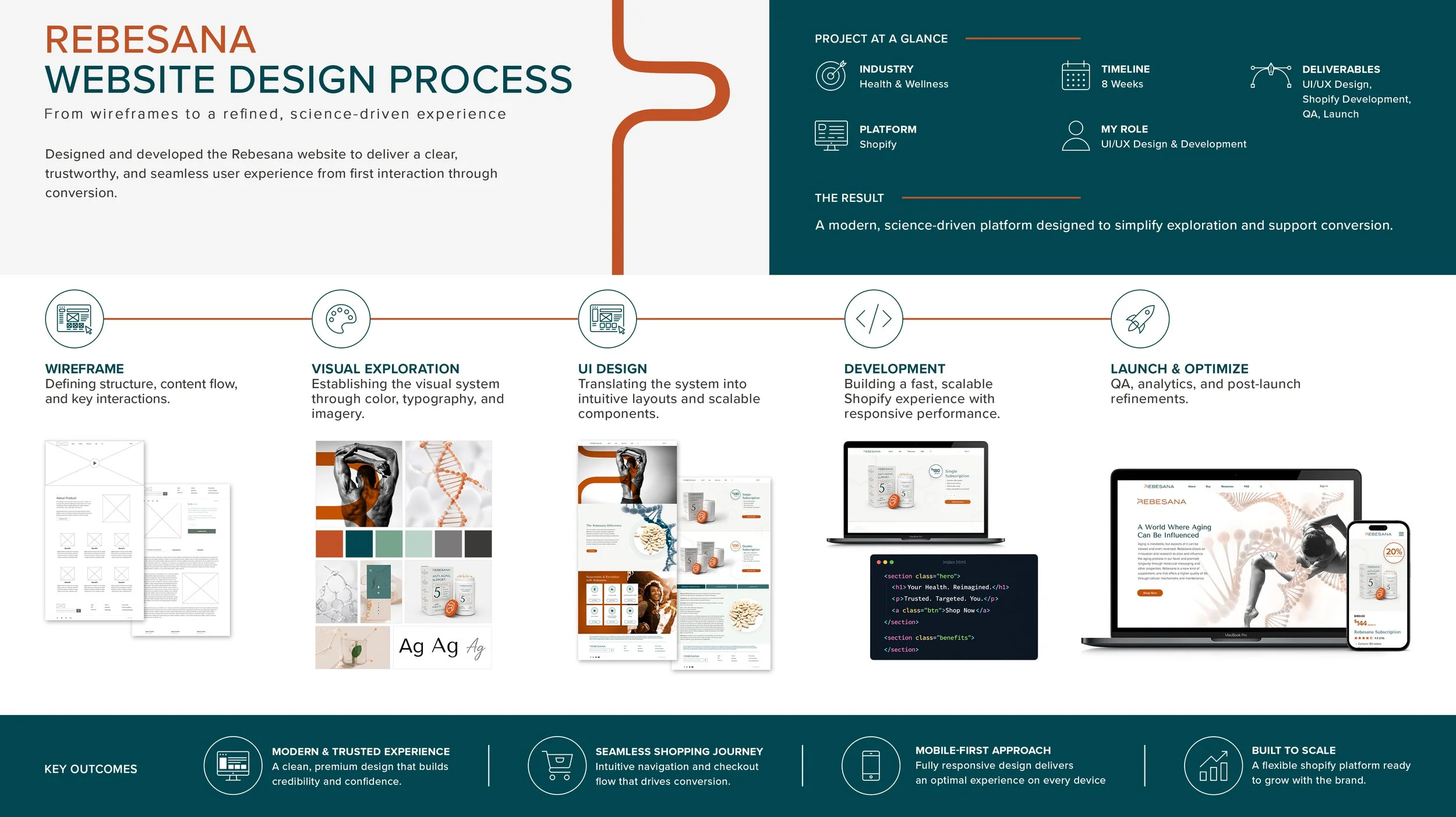
As Creative Director on the project, I led the overall visual direction for the Rebesana brand while overseeing the development of the packaging system, logo refinement, and front-end website experience. I worked closely with both the design and development teams to ensure the brand remained visually cohesive across every customer touchpoint, from the Shopify storefront and marketing materials to the product packaging and shipping experience.
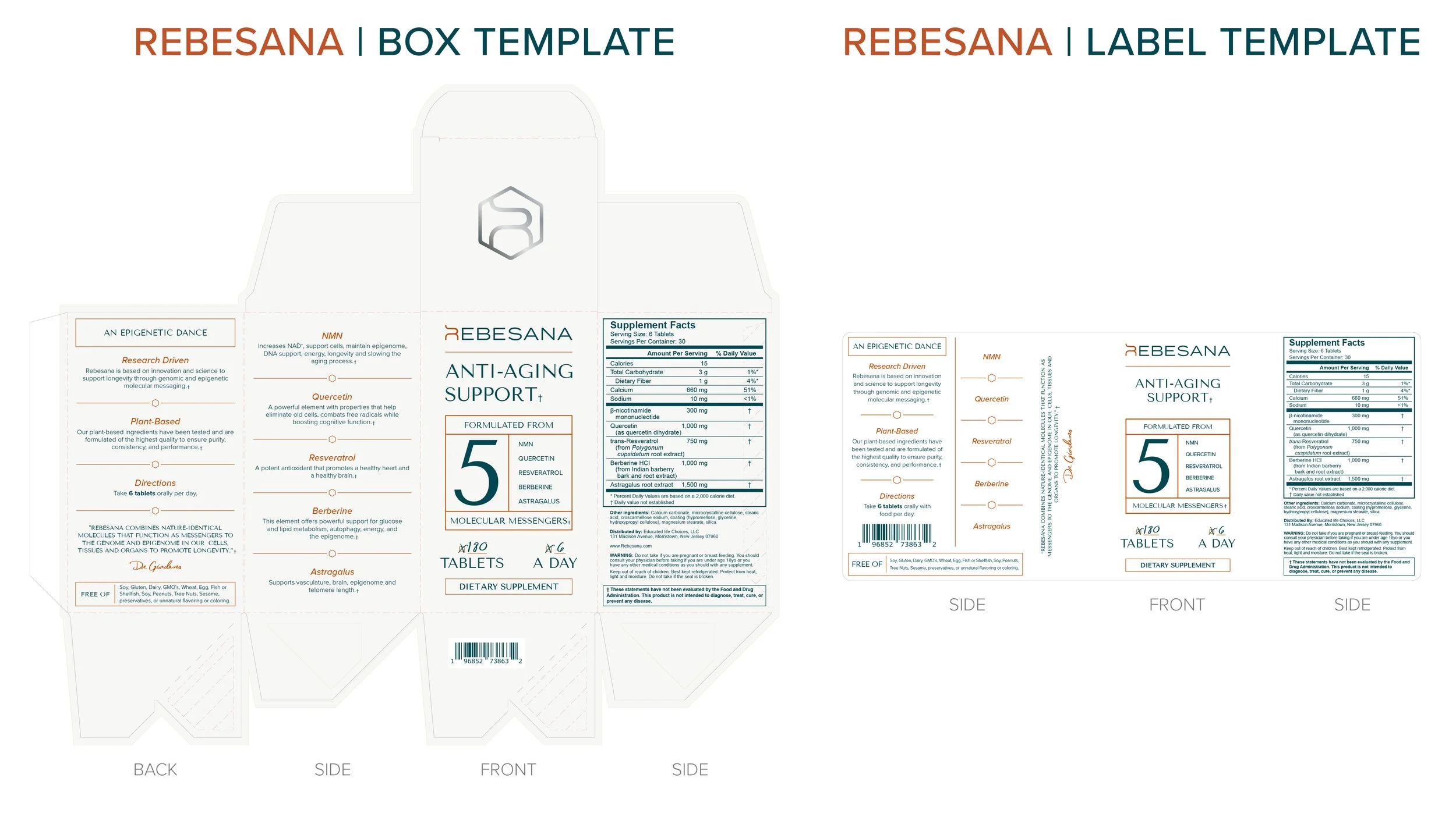
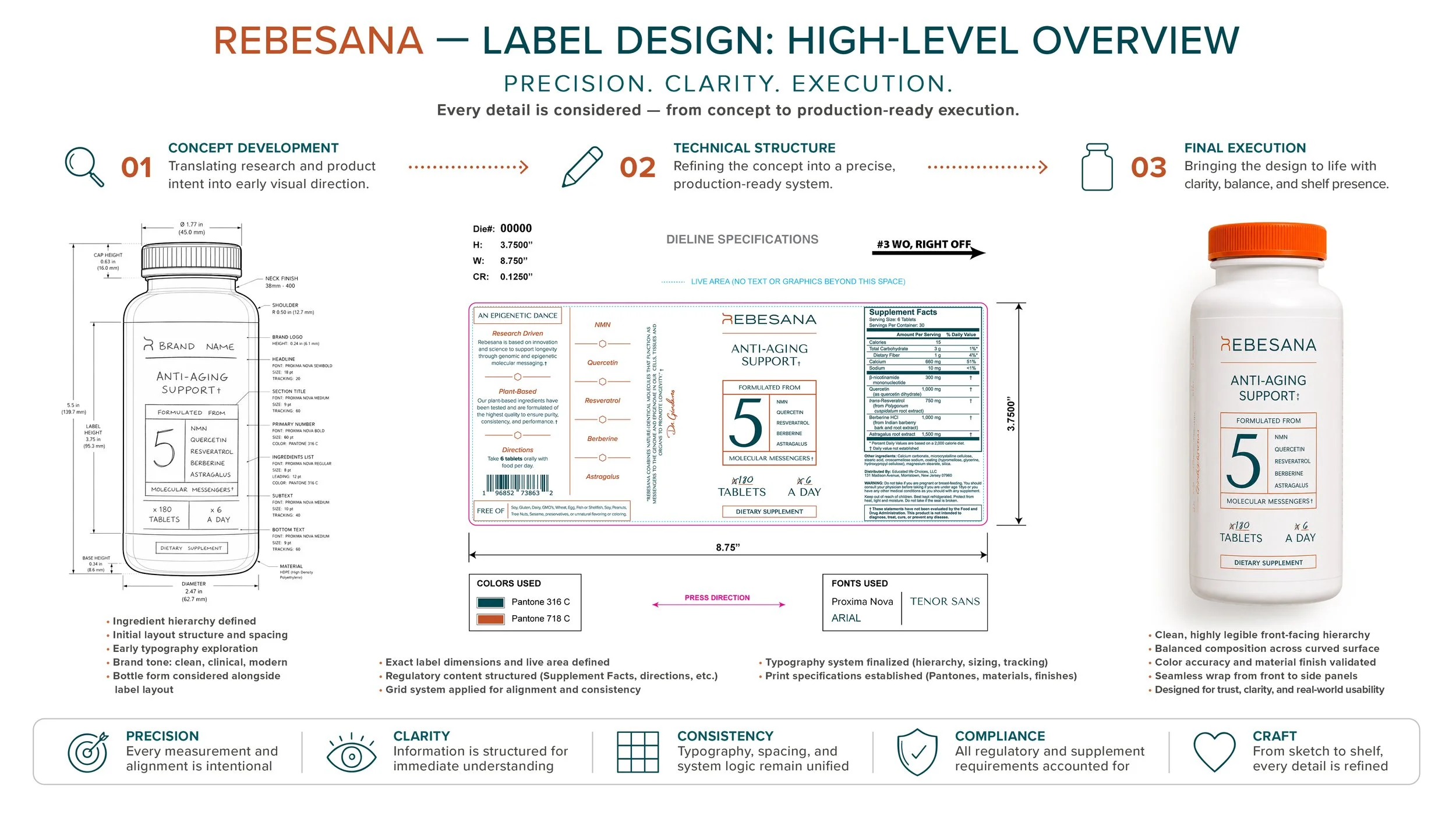
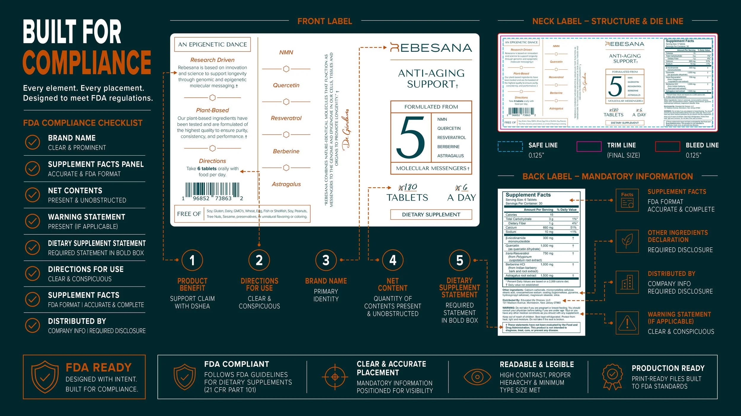
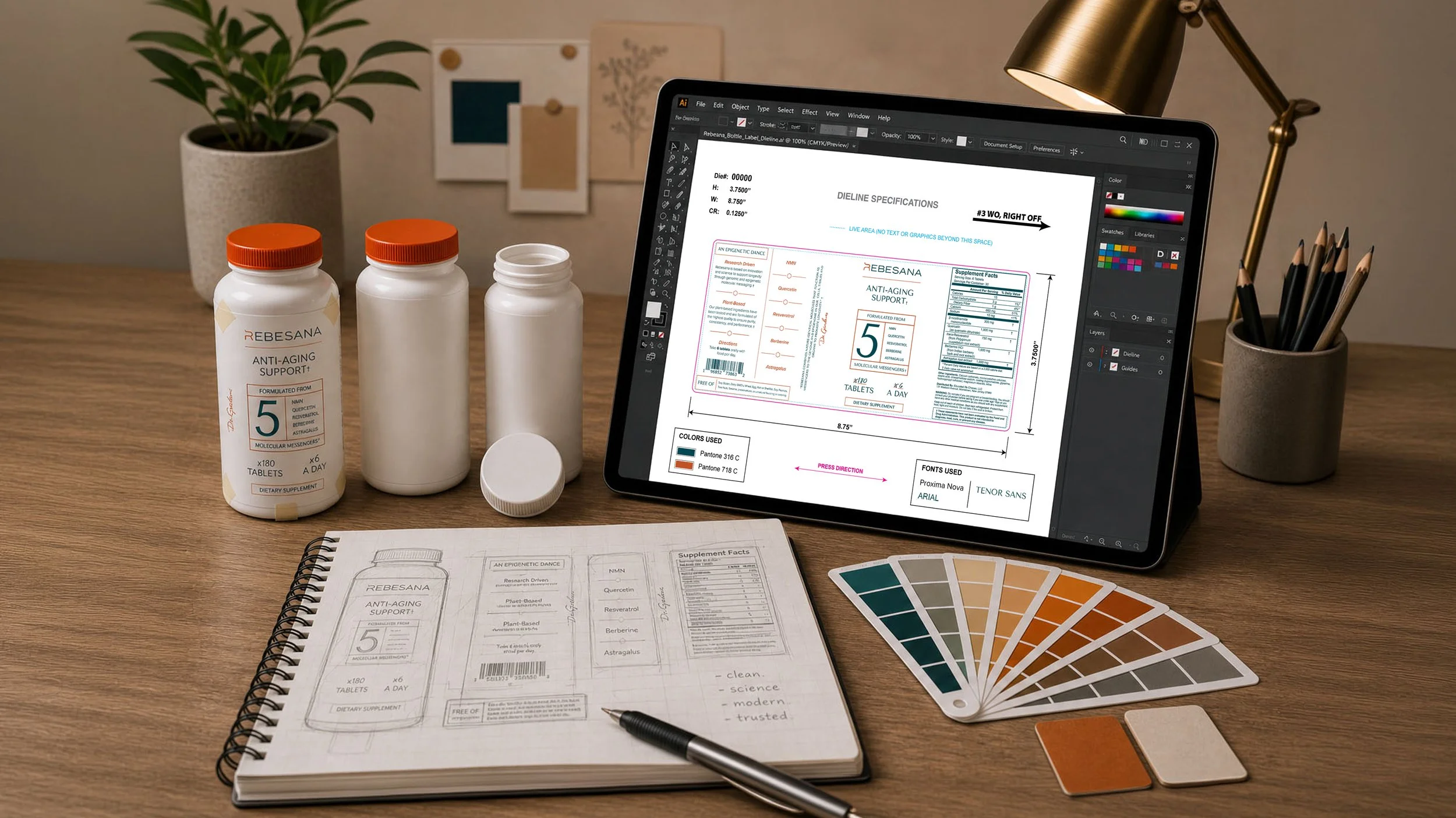
My role also included guiding packaging structure, label hierarchy, regulatory layout considerations, and production-ready execution for the product box, bottle label, and corrugated shipper packaging. With years of experience designing products that required FDA-conscious formatting and compliance considerations, I helped ensure the packaging balanced scientific credibility, readability, and premium shelf appeal.
Beyond design execution, I served as a key point of communication between the client and internal teams, helping translate complex ideas into clear creative direction while guiding the project through every stage of development.
The Challenge
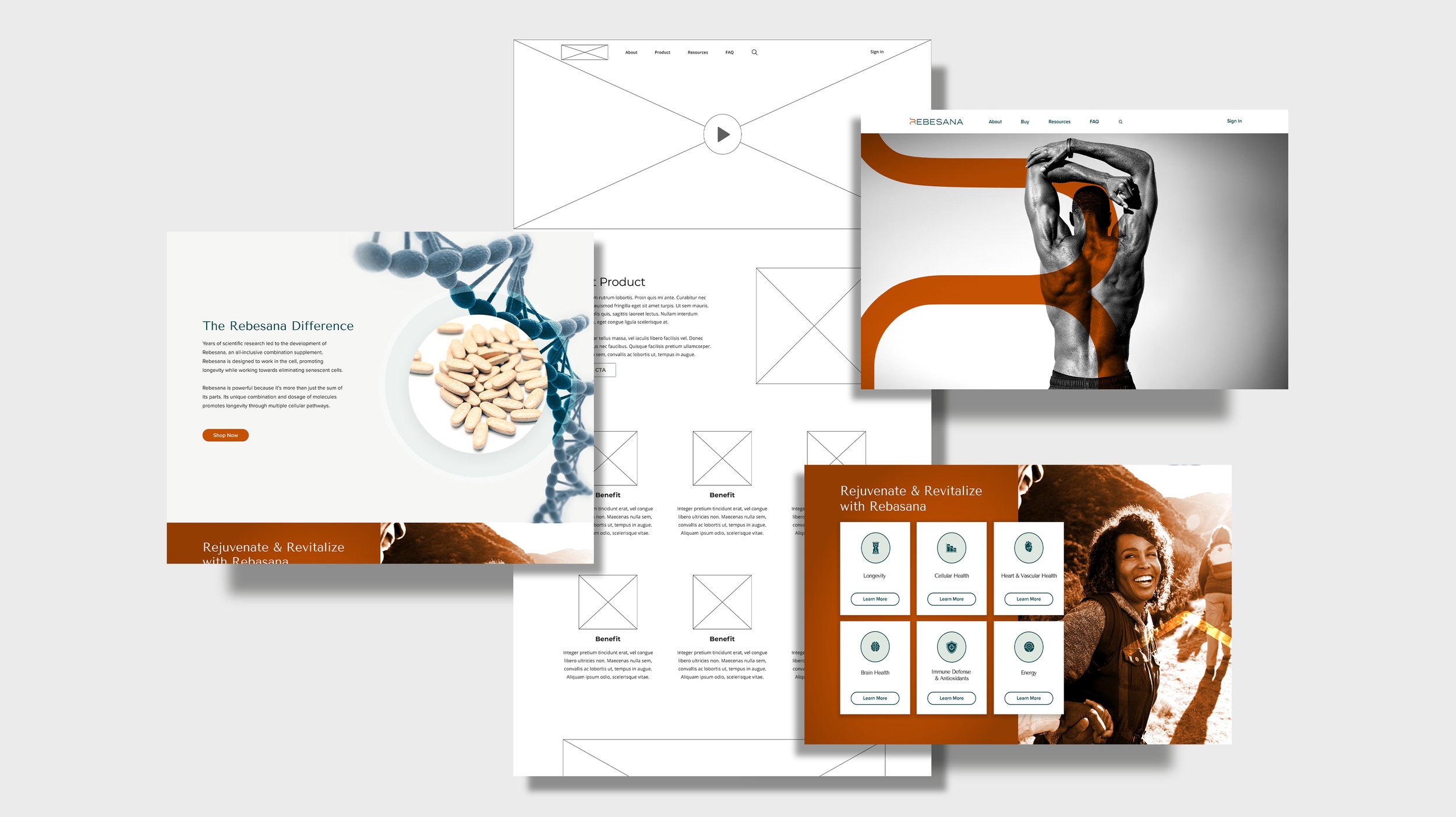
Rebesana entered the project with a formulated product and scientific vision, but no established brand identity, packaging system, or digital presence. The challenge was creating a complete wellness brand from the ground up that could communicate longevity, cellular science, and premium health supplementation in a way that felt both trustworthy and approachable.
The visual identity needed to bridge two worlds simultaneously:
Clinical scientific credibility
Lifestyle-driven wellness and longevity
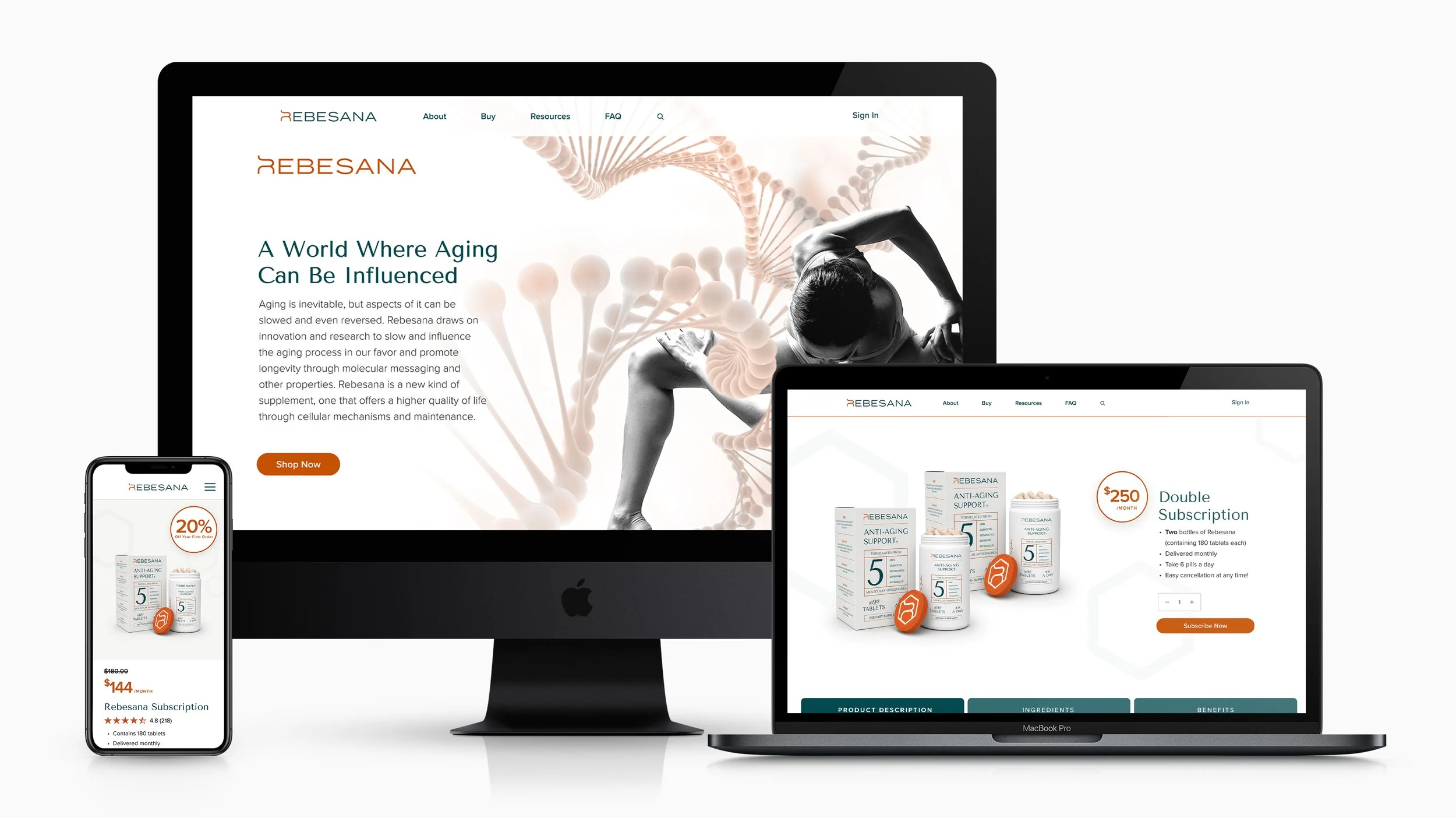
The website also needed to support a large amount of educational content, ingredient research, medical advisory information, and subscription-based purchasing while remaining clean, intuitive, and easy to navigate. In addition, the packaging had to feel elevated and premium while still maintaining clarity, compliance structure, and scalability across future product expansion.
The Solution
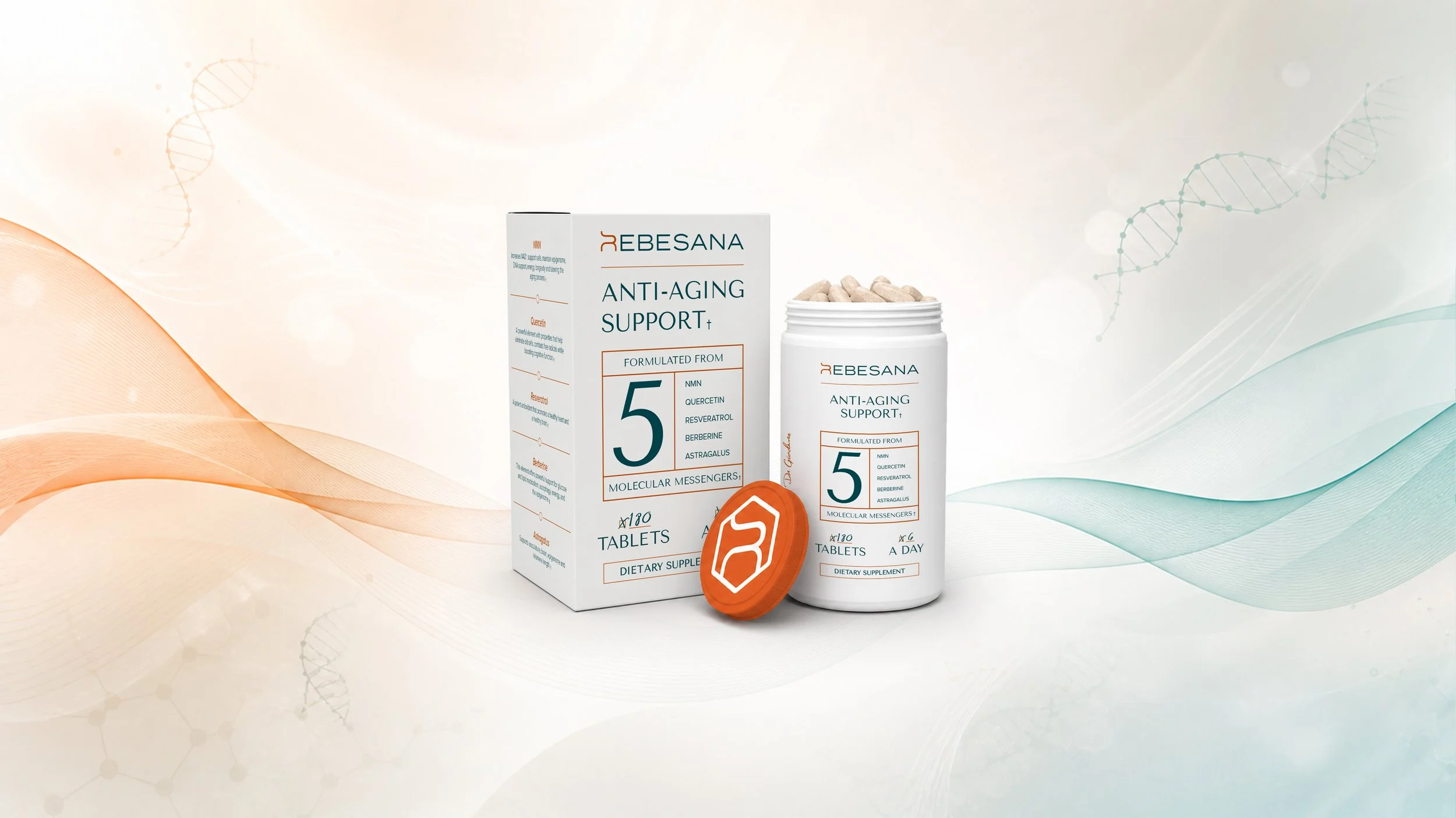
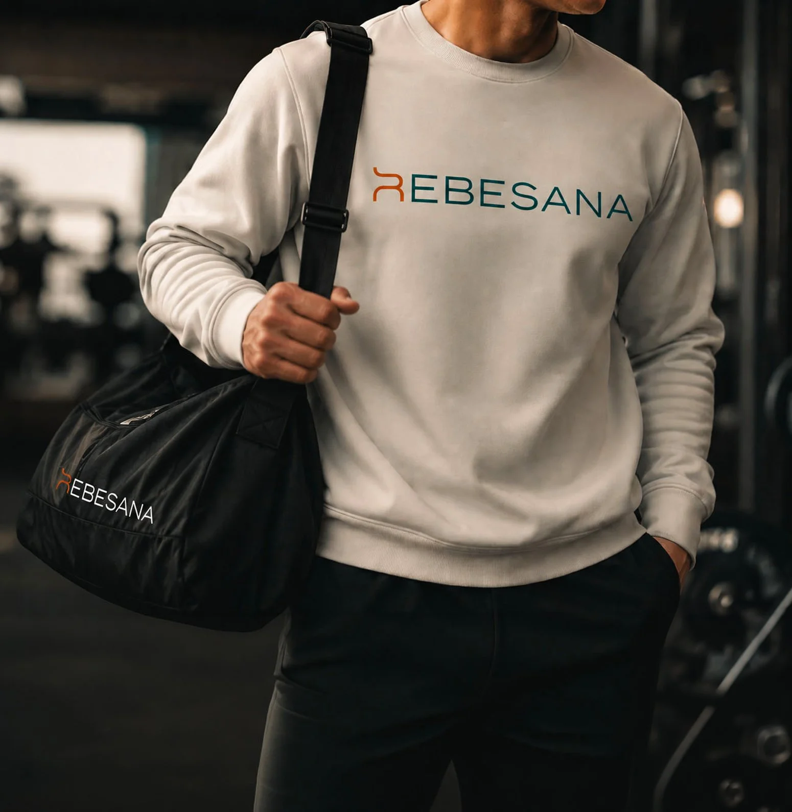
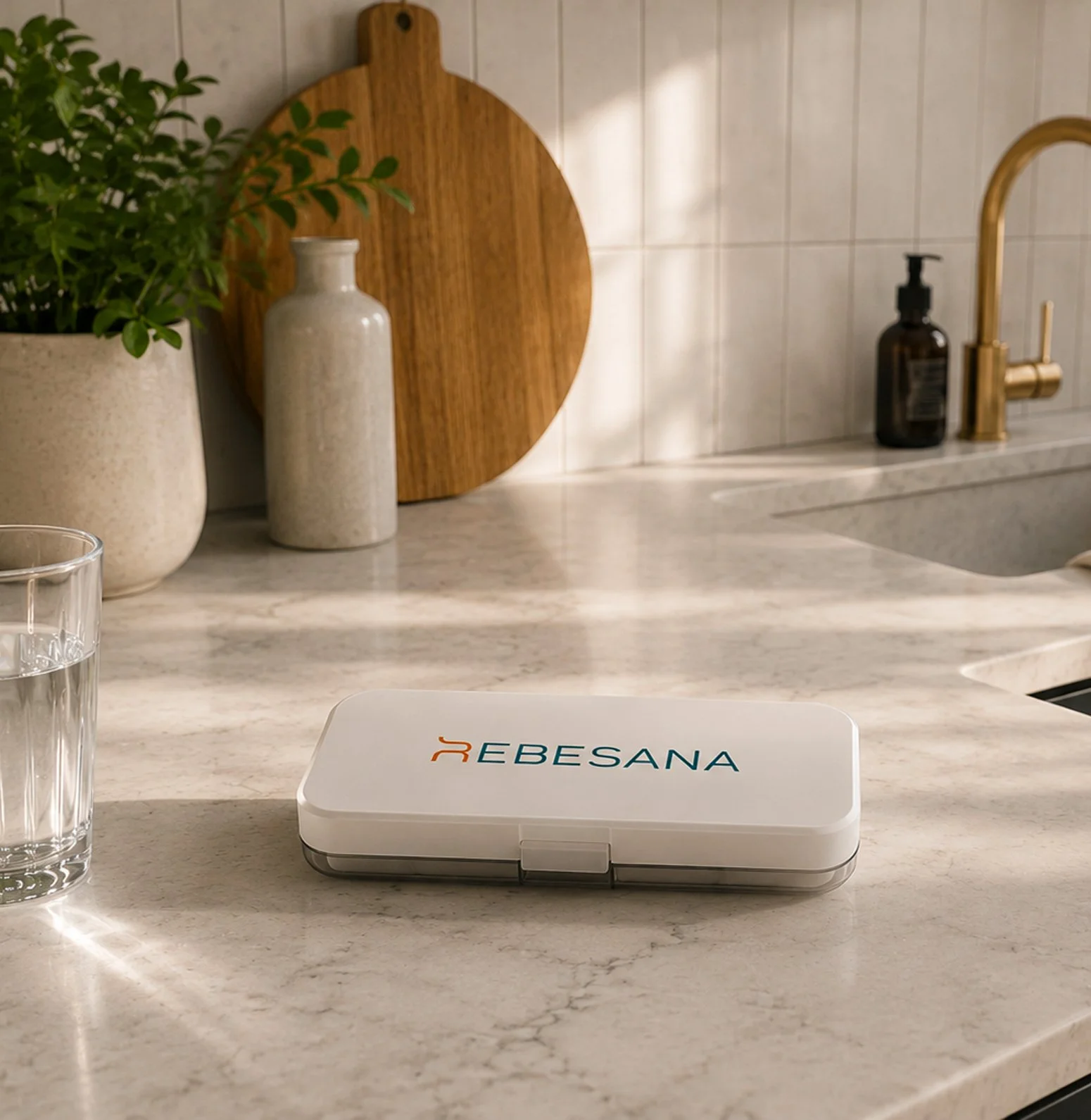
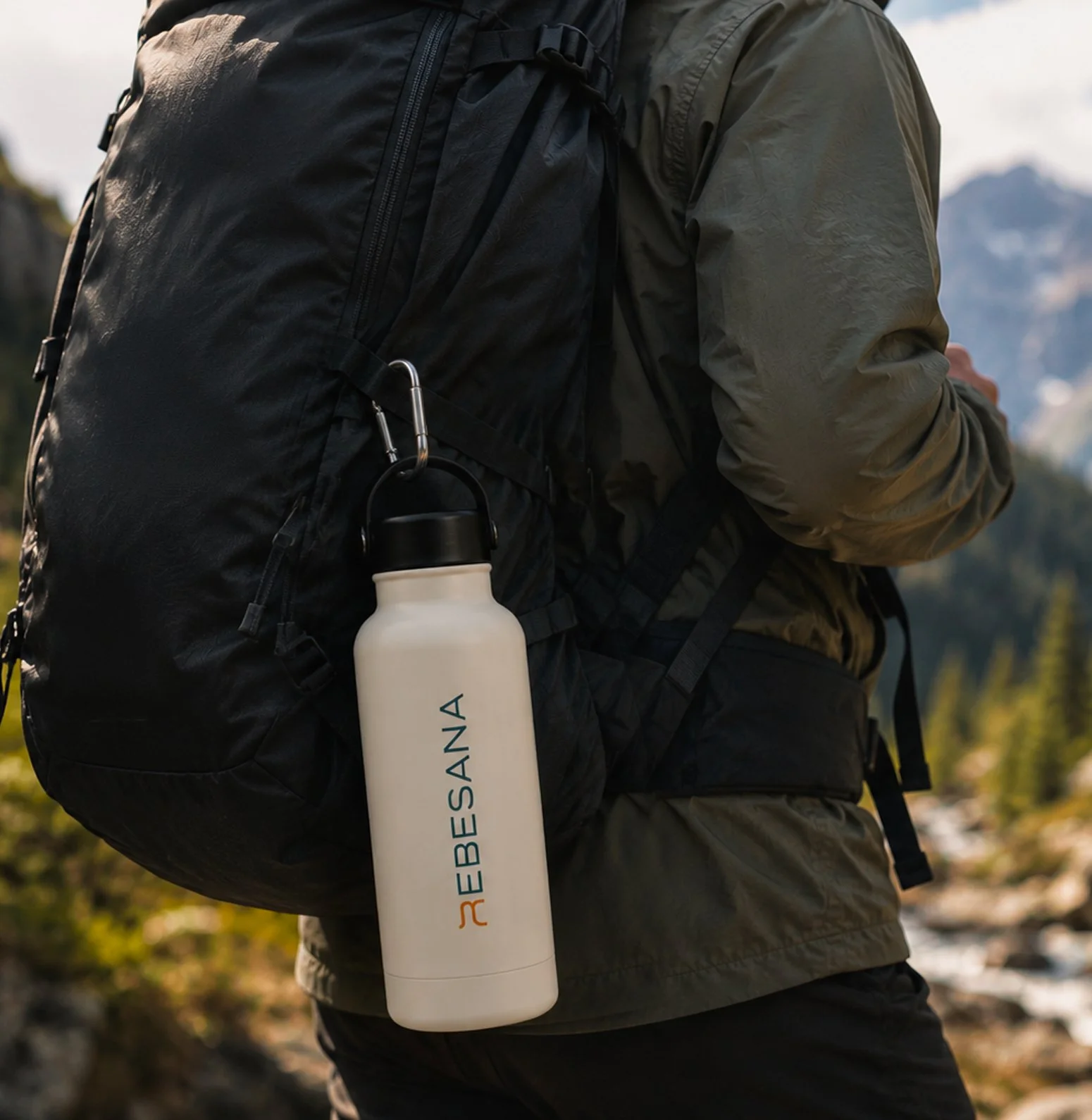
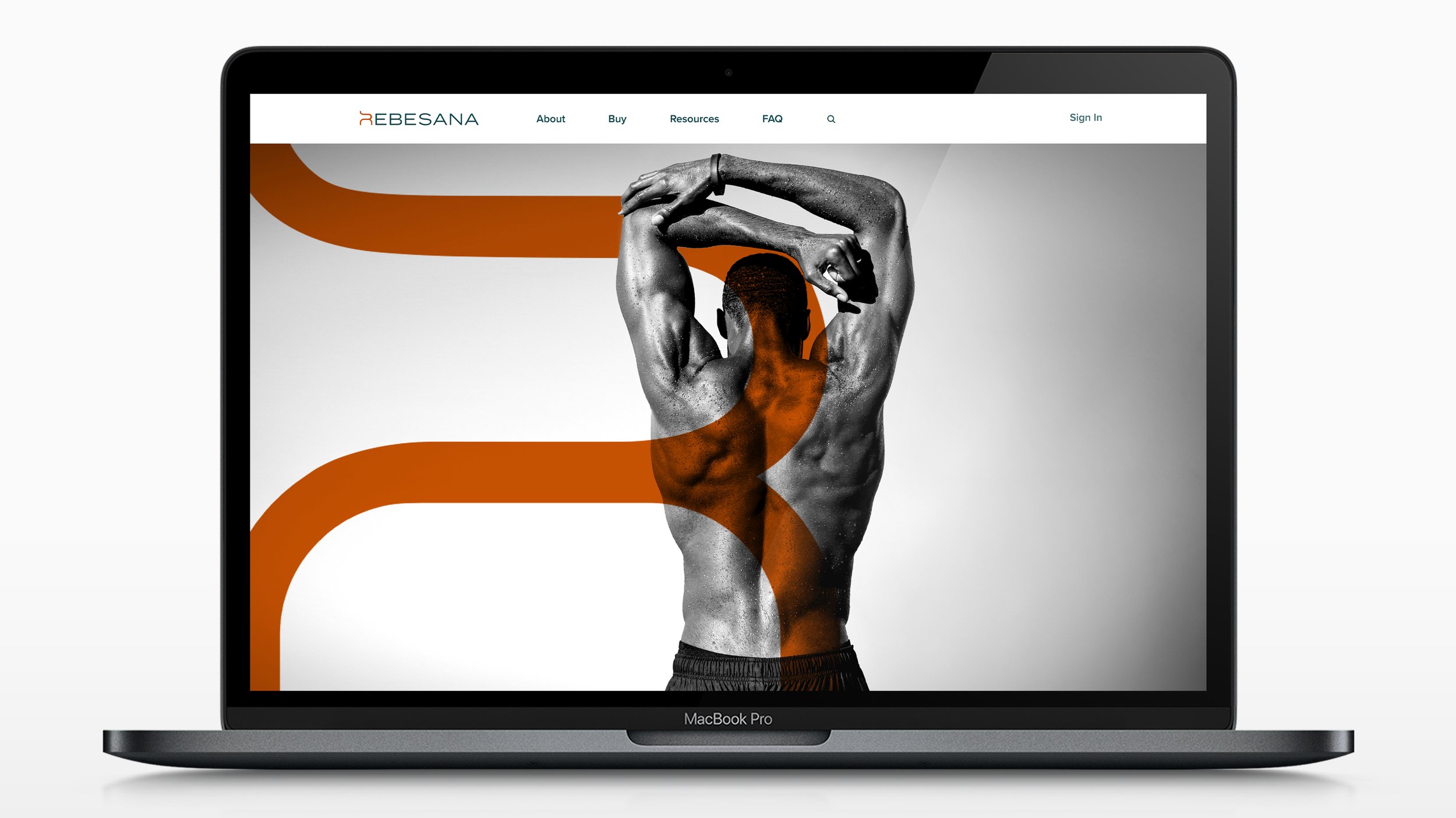
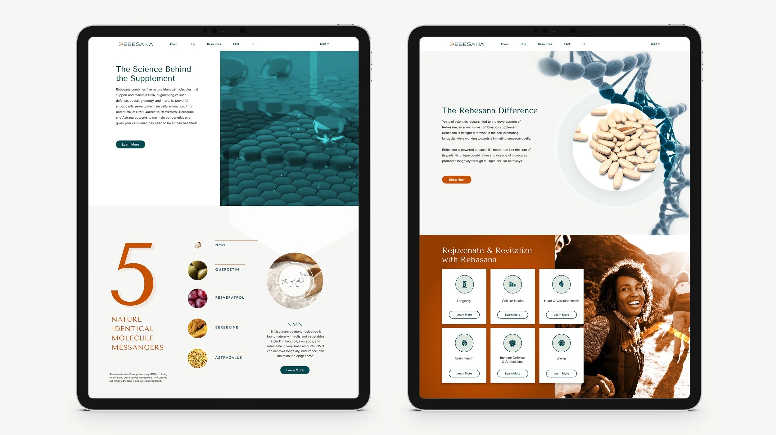
The final solution combined modern wellness aesthetics with subtle scientific influences inspired by molecular biology and genomic messaging. The Rebesana identity system was designed around clean typography, minimal layouts, structured information hierarchy, and a refined color palette that balanced warmth, trust, and sophistication.
The custom “R” icon was inspired by the flowing structure of a DNA helix, reinforcing the product’s focus on molecular longevity and cellular support. This visual language carried throughout the packaging, website, and supporting marketing materials to create a cohesive brand experience.
On the digital side, the Shopify experience was carefully organized to support both education and conversion. Ingredient research, medical insights, testimonials, subscription plans, and product benefits were structured into an approachable user experience that helped simplify complex scientific information for everyday consumers.
The final result was a polished, fully realized wellness brand system that successfully transformed a formulated product into a credible, market-ready consumer experience.
Logo
Branding
Website
Packaging